Vivid greens are subtly moving into golds and oranges and there's a bite in the air even on sunny days. My mind is moving on to what I want to do to herald the fall season. I never go all out in these things because my design aesthetic is very understated. The only vibrant things in my home are paintings which for some reason seem to have a lot of orange! I guess I'm honouring fall year round.
I was at the dollar store the other day and saw some great deals on fall foliage. Usually that means pulling bouquets apart and rearranging them so they don't look like they came from the dollar store. Follow the arrangement as I move it around my kitchen and dining room to see where it looks best.


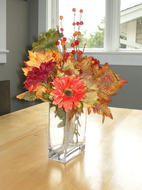
This arrangement I keep in my dining room illustrates what a difference height makes even without the bold colours of fall.
When you crop the picture the arrangement looks bold and eye catching.


When you pair the arrangement with our giant red mug it seems smaller and less eye catching.

The bouquet just can't fight the scale and vibrancy of this painting; therefore, it looks totally insignificant. You need something taller.

Enter our trusty arrangement for the sake of comparison. This arrangement works so much better because of its lack of colour and height. There's no way you can compete with the colours in the artwork so don't go there.

Nestled on my window ledge the bouquet looks comfortable, but I've created another problem. The little art work next to the bottle looks lost, and all the colour is on one side. The vignette needs balancing with an object more colourful and larger than the painting. Hummmm, what can I find?
Do you consider scale and colour when you add accessories to your home?


.jpg)


0 comments:
Posting Komentar